Logotypes
Some of my logotypes that I like the most. I making them occasionally since around 2008.


 (inscription only)
Fonts
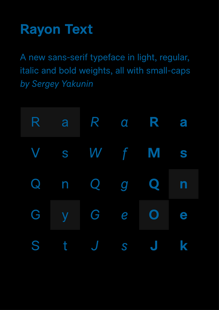
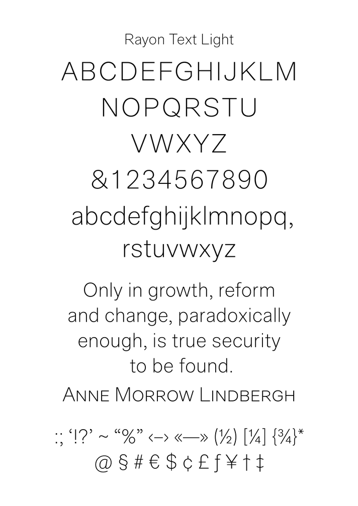
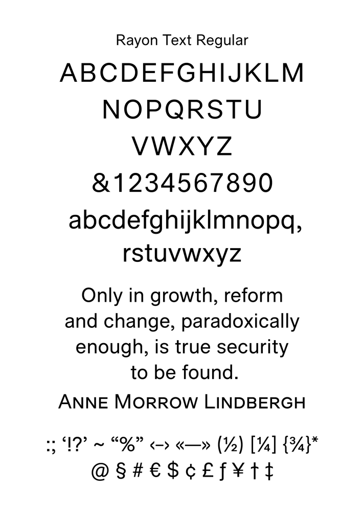
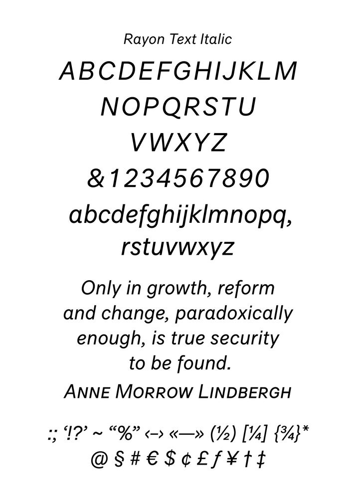
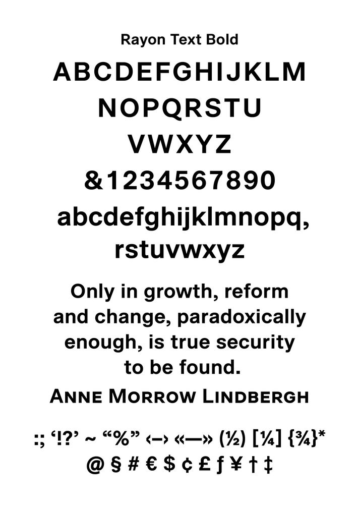
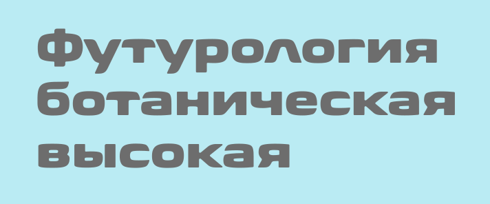
Rayon Text
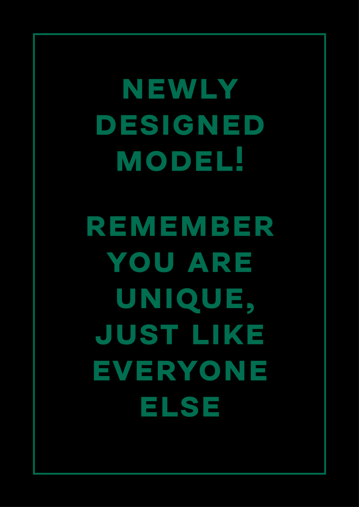
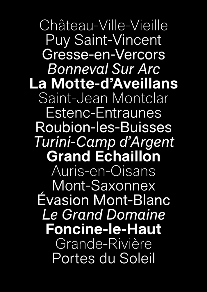
For years I was looking for a typeface to replace Arial, especially in bold titles. I made my own
version. Rayon is a sans-serif typeface in four weights, all with small caps. This typeface intended for
heading text, large inscriptions and logotypes. I also tried to avoid condensed effect, of which
some text fonts are exposed to (as it seems to me).
My initial design was a bit more wavy and fancy. I tested it for some time and decided to made more
‘texty’ version. I’m still developing it, working on condensed versions, light and black weights, and
Cyrillic alphabet.
Process insight:
-
I made first sketches of bold and regular weights in Illustrator in January, 2012.
I started with just few Cyrillic inscriptions.
-
Then I moved everything to Fontlab. I made only Latin letters and numerals, but it was MM
typeface with three axes: boldness, width and contrast.
-
Next year I was tweaking glyphs, widths, spacing. I often compared main two weights (regular and
bold) with Helvetica and Arial. I tested them in Photoshop, Indesign and browsers (thanks to
ttfautohint).
- In February, 2013 I started production of hairline, condensed, and italic versions.
-
In this project I widely used FontLab, FontForge, kerning interpolator, a lot
of python scripts, autohint, TTX tool.
See also:
-
HTML
and
PDF specimen
-
Rayon Text
at Behance
Rand
A typeface in one bold weight with Cyrillic part. It is useful for signage and logo production. Unfinished work.

Padre
Unfinished work. This typeface grew out of one logo I have designed. Four weights are almost ready at the moment and italics in progress.

Roscha
An unfinished typeface initially intended for packaging and logos.

Gramm
A tight typeface in four weights (regular, medium, bold, black) for use on the web. Unfinished work. 2008.

A few Cyrillic letters for Biome (by Carl Crossgrove)
I just wanted to see how a Cyrillic translation of nice typeface could look like.
Sans serif version of PMN Caecilia (by Matthias Noordzij)
Two years ago I got my hands on Amazon Kindle and found there PMN Caecilia, pretty cool slab typeface. I noticed that reading books in Cyrillic wasn’t an easy task. It happens because Cyrillic letters has much more serifs in average, due to such letters as ‘н’, ‘п’, ‘ы’ and so on. Caecilia has big serifs which not work well in case of Cyrillic text. Shortly after I decided to make a stub of Caecilia with no serifs — just to have a little fun.

Refinement of Cyrillic part of Playfair Display (by Claus Eggers Sørensen)
I improved the Cyrillic part of regular weight. Use arrows below to see the difference.

